Logo, colors, naming, and a ready-to-paste “Powered by SpecStep” badge. Use them in articles, integration UI, MCP-server-listing tiles, and partner sites — no permission needed. Don’t modify the marks; don’t imply endorsement we haven’t actually granted. The full license is below.
Quick downloads
The four marks most people want, as SVGs. Every variant also ships as PNG in the standard ladder (see the Logo section below).
Download the full brand kit .zip
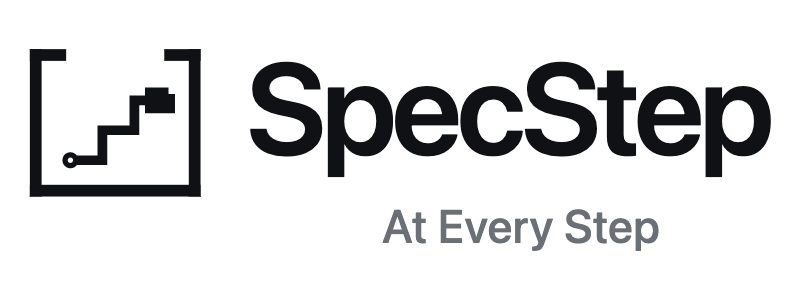
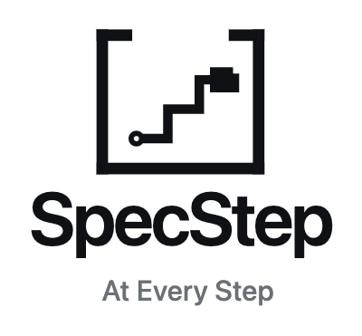
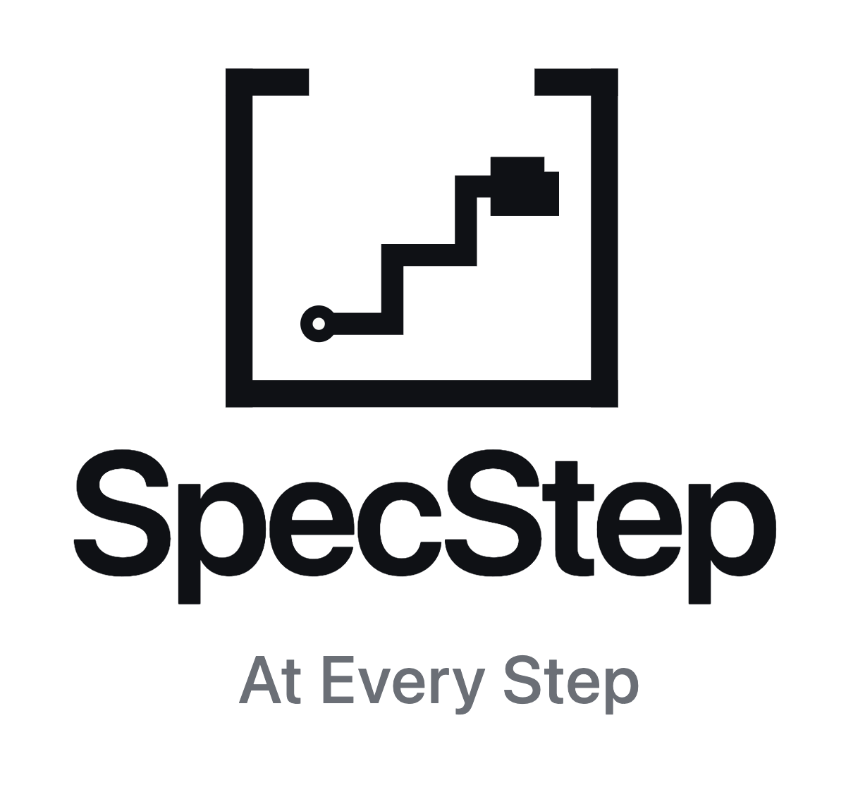
Logo
The mark is monochrome by default — ink on light backgrounds, paper on dark. Use the reversed variants where the surface is dark enough that the ink version would lose contrast.


Below 24 pixels switch to favicon.svg — the inner
record dot and waypoint nodes are dropped so the mark stays legible.
The lockup with the tagline — “At Every Step” set beneath the wordmark — is the full logo. Use it wherever it renders at a legible size: the horizontal lockup at ≥ 28 px tall, the stacked lockup at ≥ 64 px. Below that, drop the tagline and use the plain wordmark or the compact (no-tagline) lockups.
All logo files
mark.svg— primary mark, ink on light. PNG 64 · 128 · 256 · 512 · 1024mark-reversed.svg— reversed mark, paper on dark. PNG 256 · 512 · 1024mark-currentColor.svg— inherits color from your CSS; ideal for theme-aware embeds.favicon.svg— simplified geometry for ≤32 px display.wordmark.svg— the “SpecStep” type alone.logo-tagline/lockup-horizontal.svg— the full logo: mark + wordmark + “At Every Step” tagline on one line. Reversed variant for dark surfaces. PNG 400 · 800 · 1600. Use at ≥ 28 px tall.logo-tagline/lockup-stacked.svg— mark above wordmark + tagline. Reversed variant for dark surfaces. PNG 400 · 800 · 1200. Use at ≥ 64 px tall.lockup-horizontal.svg— compact, no tagline: mark + wordmark on one line, for sizes below the tagline floor. Reversed variant for dark surfaces.lockup-stacked.svg— compact, no tagline; use where horizontal space is tight.
Colors
The accent green is the primary brand color. --accent-700
is the canonical fill for primary buttons, links, and brand emphasis on
light surfaces; the lighter shades are for hover, focus, and dark-mode
inversion. Ink and paper are the monochrome logo-fill colors.
#117b50
#21b878
#169a63
#0c5e3d
#0F1115
#FAFAF7
Typography
The wordmark uses Inter or Geist at weight 600, 120 px nominal size, with -3.5% letter-spacing. The marketing site body text uses a system sans stack — Segoe UI Variable on light theme, Inter on dark theme, with platform fallbacks. You don’t have to match our type to use our marks; the wordmark SVG renders correctly even if your reader doesn’t have Inter installed.
Naming & capitalization
- The name is SpecStep — one word, two capitals. Always.
- Not “Specstep”, “Spec Step”, “spec-step”, or “SPECSTEP”.
- Logo tagline: “At Every Step” — set beneath the wordmark in the lockup.
- Descriptive taglines: pick the line that fits the audience — see Boilerplate & descriptions below.
- Pronunciation: spec-step — two syllables, equal stress.
- SpecStep is the product. The operating entity is No Compromise AI; both can be named, but most contexts only need the product name.
Boilerplate & descriptions
Approved language for press, integration directories,
MCP-server listings, and partner pages — copy it as-is rather
than inventing a weaker summary. It also ships as
BOILERPLATE.txt in the
brand kit.
Descriptive taglines by context
The logo tagline is “At Every Step” (set beneath the wordmark). For prose, reach for the descriptive line that fits the audience:
| Context | Approved line |
|---|---|
| Primary / team framing | A team of specialists, one conversation. |
| Buyer outcome / non-technical | Turn messy product ideas into build-ready specs. |
| Category | The requirements-to-build system for AI-assisted software teams. |
Approved descriptions
- Category
- The requirements-to-build system for AI-assisted software teams.
- Operating entity
- SpecStep is operated by No Compromise AI, a Delaware corporation.
- Short — about 25 words
- SpecStep turns an idea into a build-ready spec package. Otto interviews you, brings in specialist agents, and ships documentation your AI coder follows without drifting.
- Standard — about 50 words
- SpecStep is a requirements-to-build system for AI-assisted software teams. You describe your product in plain language, Otto interviews you, and the right specialist agents (architecture, security, data, and more) join as the project needs them. The result is a documentation package your AI coder can build from without drifting or reinventing what already exists.
License & permission
These assets are free to use to identify SpecStep — in articles, blog posts, integration tile UI, MCP-server-listing sites, “Powered by” badges, partner pages, and similar.
You don’t need to email us. Treat this page as the standing permission. If you’d like to share a draft anyway, we’d be happy to take a look — drop us a line.
Don’t modify the marks: no recolor, no gradients, no transforms, no redrawing. Don’t imply endorsement, sponsorship, or partnership we haven’t actually granted. Don’t use the marks to identify a competing or substantially similar product.
Fine without asking
- “Works with SpecStep”
- “Generated with SpecStep”
- “Powered by SpecStep”
Not without our approval
- Official SpecStep partner
- SpecStep certified
- Co-brand lockups that imply partnership
“Powered by SpecStep” badge
Drop this anywhere on your site. The badge uses the compact no-tagline lockup — it reads cleanly at 24 pixels tall in footers, hero strips, or partner rosters, where the tagline would be too small to read. For larger placements, reach for the tagline lockup above.
<a href="https://specstep.com" target="_blank" rel="noopener">
  <img src="https://specstep.com/specstep-brand/svg/lockup-horizontal.svg"
       alt="Powered by SpecStep" height="24" />
</a>
<a href="https://specstep.com" target="_blank" rel="noopener">
  <img src="https://specstep.com/specstep-brand/svg/lockup-horizontal-reversed.svg"
       alt="Powered by SpecStep" height="24" />
</a>
MCP-server-listing tile
Building a SpecStep tile for an MCP-server registry, Cursor catalog, Claude Desktop directory, or similar? Use the bare mark on a card background that matches your listing surface. Recommended pairings:
- List rows (16–32 px square):
mark-32.pngorfavicon.svg. - Card thumbnails (64–128 px square):
mark-128.png. - Hero tiles (256 px square and up):
mark-256.pngormark.svg.
On dark surfaces use the reversed variants
(mark-reversed-256.png,
mark-reversed-512.png).
Add at least 16% clear space around the mark; don’t place it on a
background tinted with our brand green (it disappears).
Logo don’ts
- Don’t recolor the mark with brand-foreign hues — stay monochrome.
- Don’t apply gradients to the primary mark.
- Don’t separate the mark from its frame, or redraw any part.
- Don’t add shadows, outlines, or glows.
- Don’t squish or stretch — uniform scale only.
- Don’t pair the mark with another brand mark in a way that implies a partnership we haven’t announced.
- Don’t use the mark on dark patterns or content we wouldn’t want to be associated with (deceptive UI, harassment, illegal-content platforms, etc.).
One last thing
Doing something large-scale or unusual and not sure whether it’s covered? Email us — we’d rather you ask than not. We’ll get back to you fast, and most answers are yes.